

We exist to show consumers all possible medication options for whatever conditions they may have. With our previous interface, it could be difficult to compare the prices of those options without clicking back and forth between screens. Comparison View solves the problem.Here’s how it looks following a search for a commonly prescribed cholesterol drug:
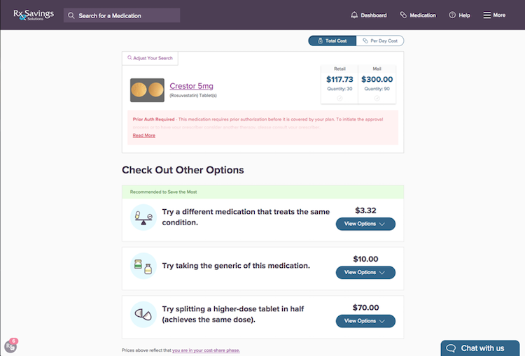

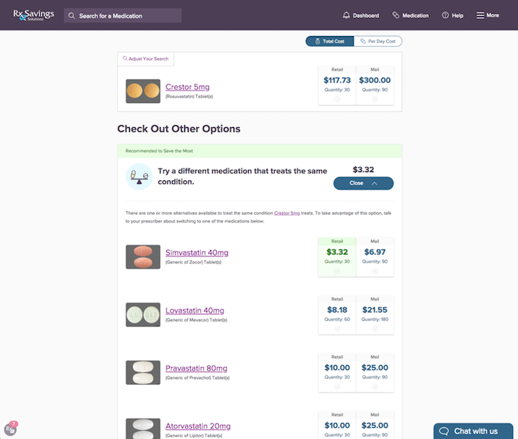
Then a user clicks the “View Options” button for any of the three suggestion types, the section expands to display all available options and prices.

Another component to Comparison View is the added ability to toggle between Total Cost and Per Day Cost, which comes in handy when evaluating prices between 30- and 90-day fills.
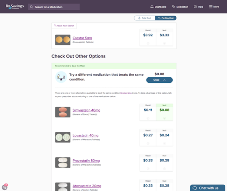

Now it’s possible to compare prices for multiple suggestions—make that every suggestion—all on one screen. You might say the old view was designed for education; the enhanced view is designed for shopping.Why change a good thing? Because it can always get better.


